Creating a High-Converting Website. Why Ugly Sites Convert Better
Creating a High-Converting Website. Why Ugly Sites Convert Better
Last Updated: November 17h, 2024
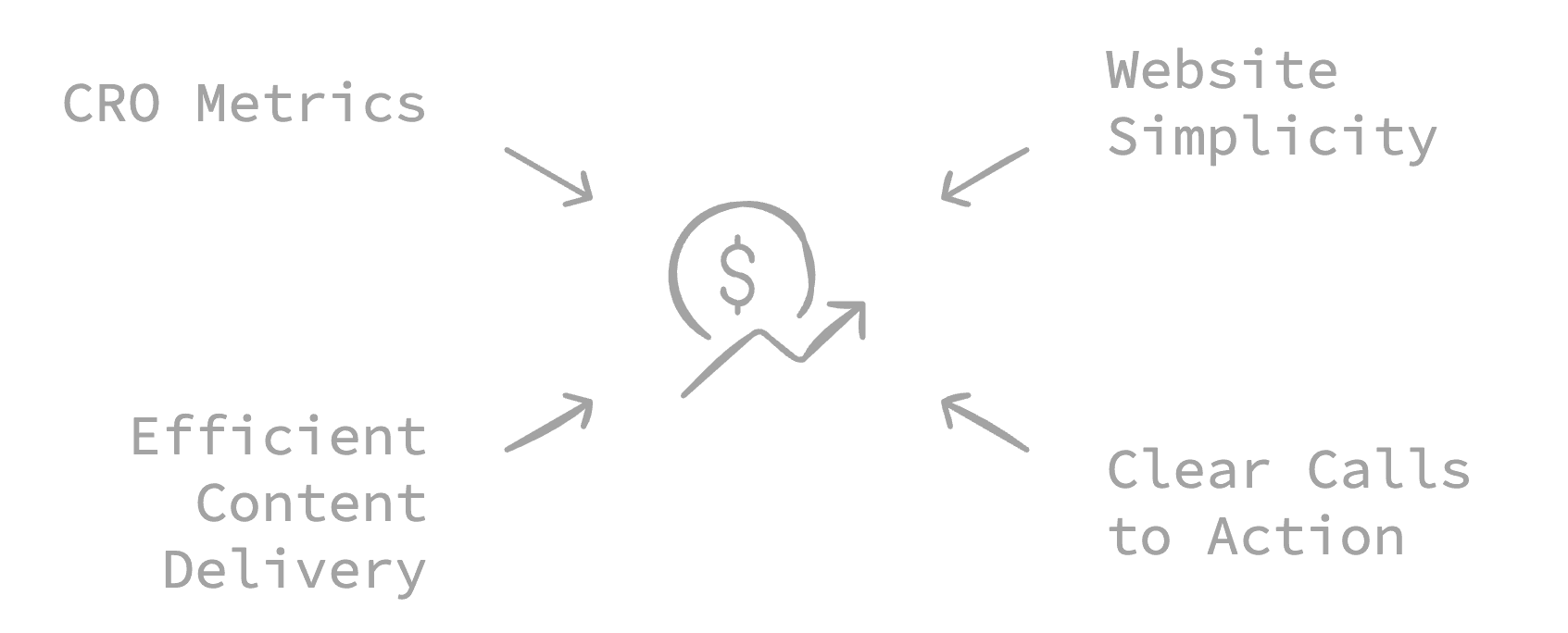


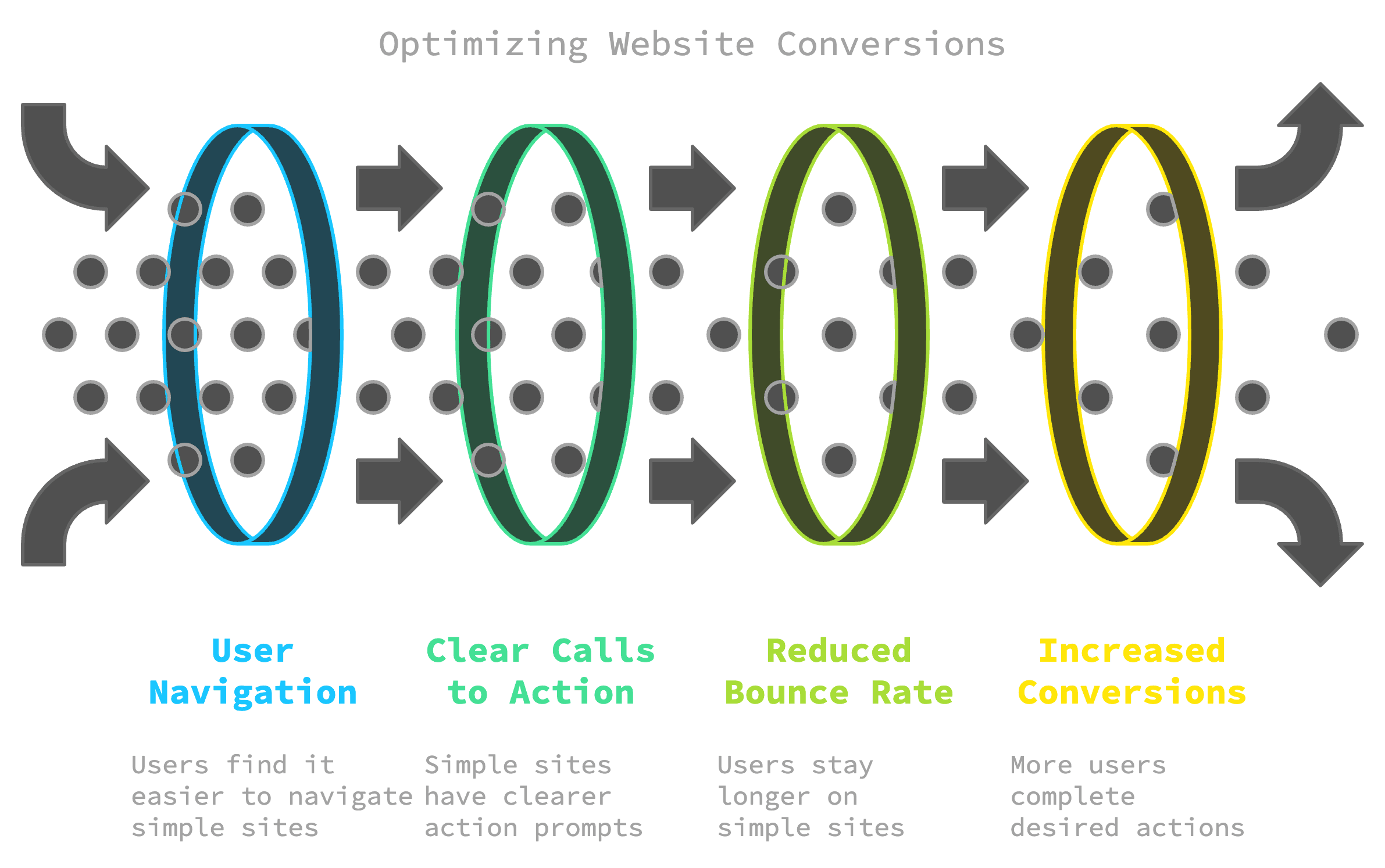
Ugly and simple websites convert users better than visually stunning websites.
It’s a dark secret in the marketing and agency world and something most branding agencies won’t tell you when redesigning your website. Simple and “ugly” websites are easier to navigate, provide clearer calls to action and relay content more efficiently to users when compared to websites with fancy graphics, advanced animations & abstract layouts.
Understanding Conversion Rate Optimisation
Conversion Rate Optimisation (CRO) has the main goal of increasing your website’s overall conversion rate. Depending on your business, this is the number of users reaching out via a contact form, buying a product online, sending an email, downloading a guide, etc. When optimising for conversion rates, we are trying to get more users to become customers without requiring more spend on marketing or promotion.
CRO metrics can come in many shapes and sizes. The obvious ones are the number of form submissions a page got or the number of checkouts a store got on a certain day. But, we also care about other important metrics that often get overlooked by businesses.
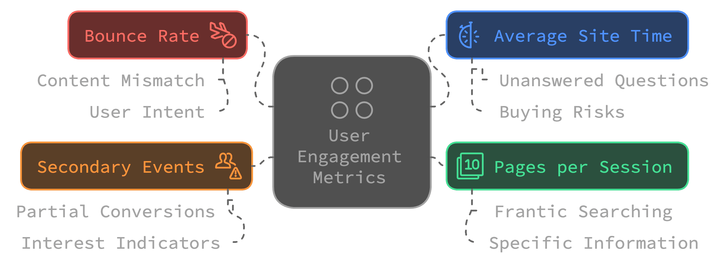
Bounce rate – How quickly are users leaving a page once they click an ad or search result. High bounce rates often hint at a mismatch between content and user search intent.
Average site time – How long are users spending on the site before exiting across all pages. If a user spends a long time on the site but doesn’t convert, did we address all the questions they might have? Perhaps we didn’t effectively address their perceived buying risks.
Pages per session – How many pages are users getting to before leaving the site? Are they frantically trying to find a specific piece of information or are they visiting 1-2 pages before leaving.
Secondary Events – Are users doing things that aren’t considered a conversion but still show interest? Are they partially filling out the checkout fields or are they viewing the pricing page multiple times in a session?
Understanding What We Mean by an “Ugly” Site
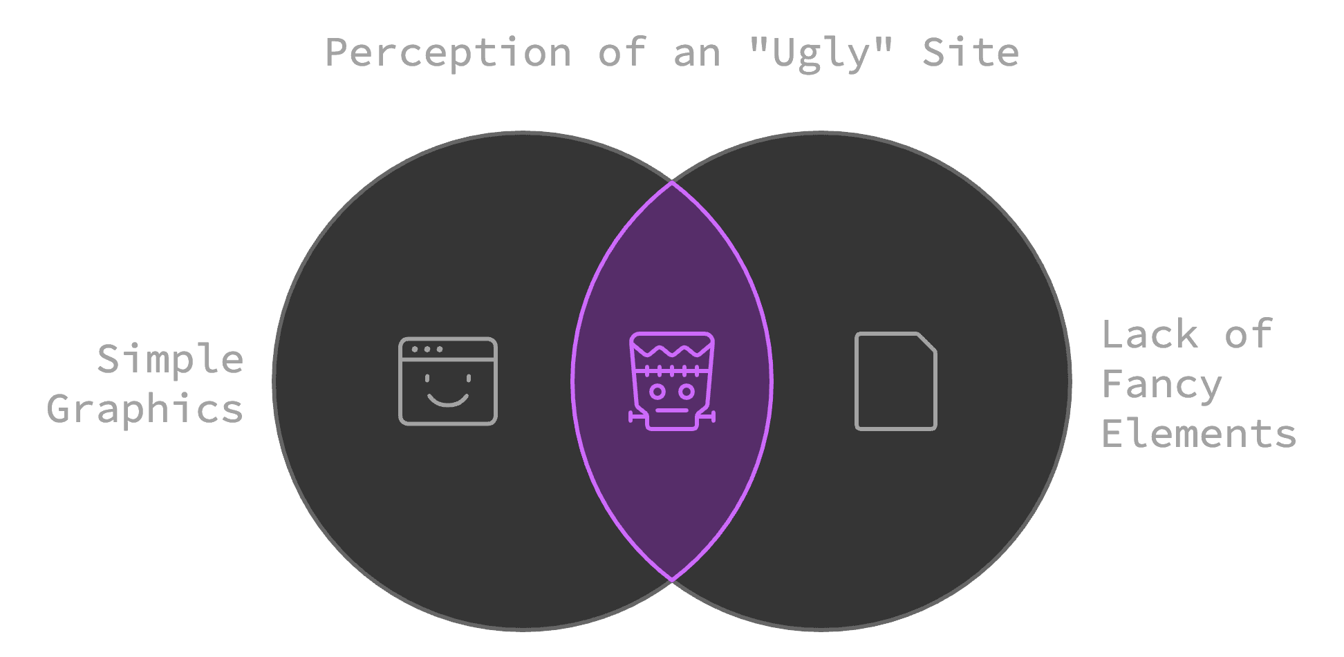
Ugly is a broad term and could be different for each person. When we talk about an ugly site, we think of a site with simple graphics, lacking any fancy animations or abstract layouts which would be considered unconventional to the normal user. A great example of a popular but ugly site is Amazon.
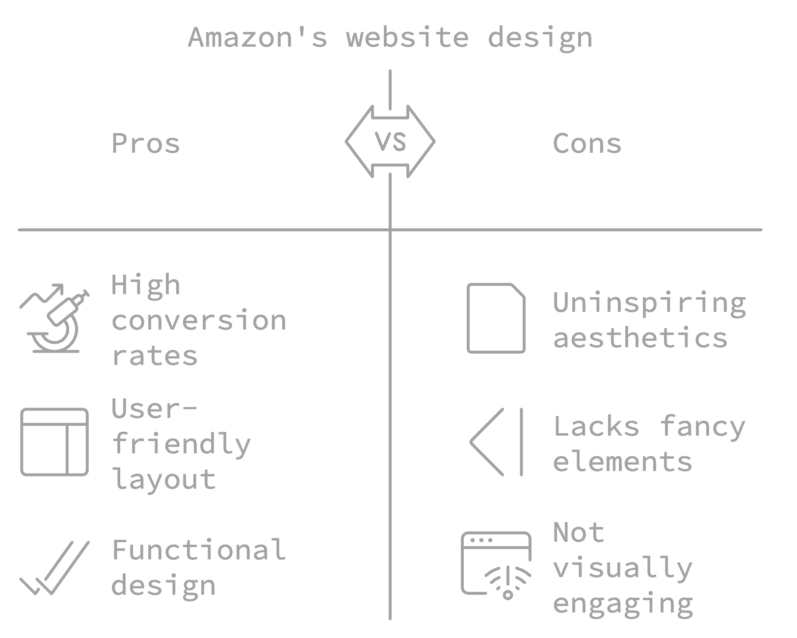
Amazon has teams of designers, strategists and developers working to convert users at the highest rates possible. However, if you hop on their site, you’ll find the design overall uninspiring with no fancy graphics or “WOW” elements to engage with users. The site focuses on displaying the information users need, in the format they need it, in the place they expect to see it.
Ugly can also be considered conventional by some users. A conventional site has a generic header with a logo on the left and a menu on the right. It has a slider up top and some text and products below. Most of the elements stay within the centre of the screen and nothing moves too much unless the page is scrolled or interacted with. This is a stark contrast to most branding agency websites where the expertise of the agency is shown through their ability to create visually stunning yet abstract websites.
Why Ugly Websites Will Always Convert Higher Than Pretty Websites
Pretty websites decrease Conversion Rates because they abstract the value offer of the website as perceived by the user. When trying to optimise a website for conversions, we try to reduce the perceived buying risk of the user. We do this by addressing their concerns up front while also making the site easy to use in a format they can expect.

Have you ever tried using a new mouse or a new keyboard? You bought this shiny new keyboard which you know is better than your last one but for some reason you don’t feel great using it. The keys are slightly further apart, they don’t click as far, and the space bar is still stiff. This is kind of how users feel when a website is visually stunning but doesn’t fit into the same comfortable format they have come to expect from websites.
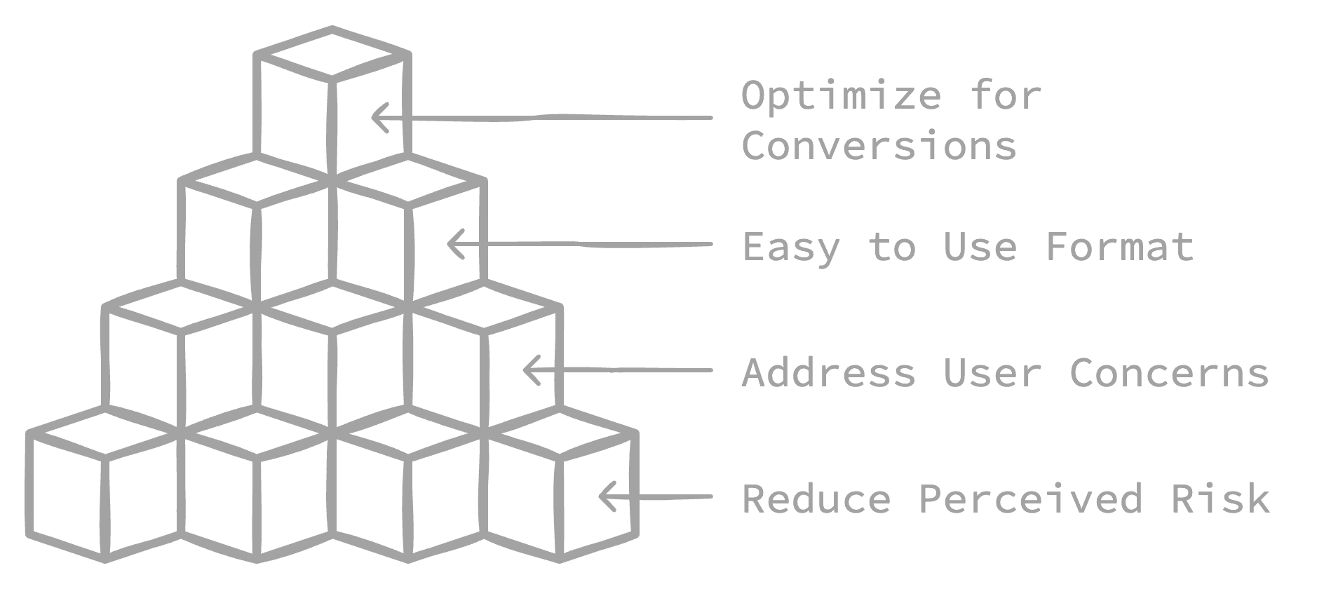
Ugly websites unintentionally present information and choices to the users in an optimal way by not abstracting them through fancy graphics or odd page placements. All the buttons are exactly where you think a button should be... If you wanted to get in touch you know that the contact page link is very likely in the top right of the menu. These are all subtle untrained expectations users have when browsing online thanks to the many years of websites using a standard layout.
Visually Stunning websites tend to also load more slowly for users because of all the additional overhead that comes with showing fancy graphics and animations. New users are incredibly impatient when it comes to websites loading. If you are sitting at home on Wi-Fi then awesome, even an unoptimized mess will load within a respectable time.
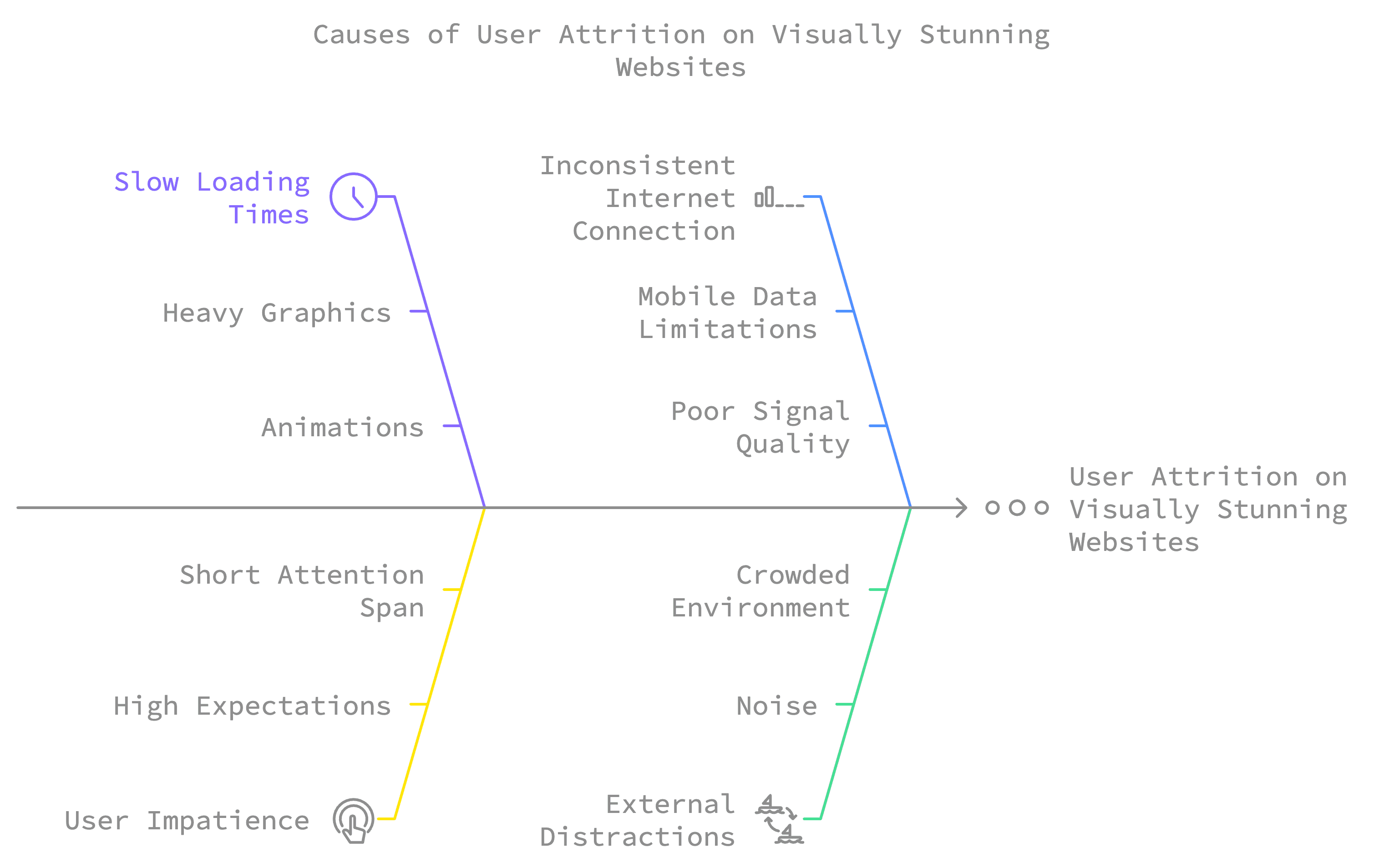
But... Pretend you are on a ferry travelling from Auckland to Waiheke. You are on your phone, the internet connection is inconsistent, the ferry is packed with loud kids and you have had a long day at work. Now all of a sudden a website that loads in 3 seconds at home may take 10-20 seconds to load on the ferry. You’ll lose that user before they even get to see a single page load.
Building High Converting Visually Stunning Sites with Conversion-Centered Design Principles
Conversion-Centered Design (CCD) is a framework for building high-converting websites and landing pages that are both visually stunning and also high converting. The following principles will help you create a high-converting website.
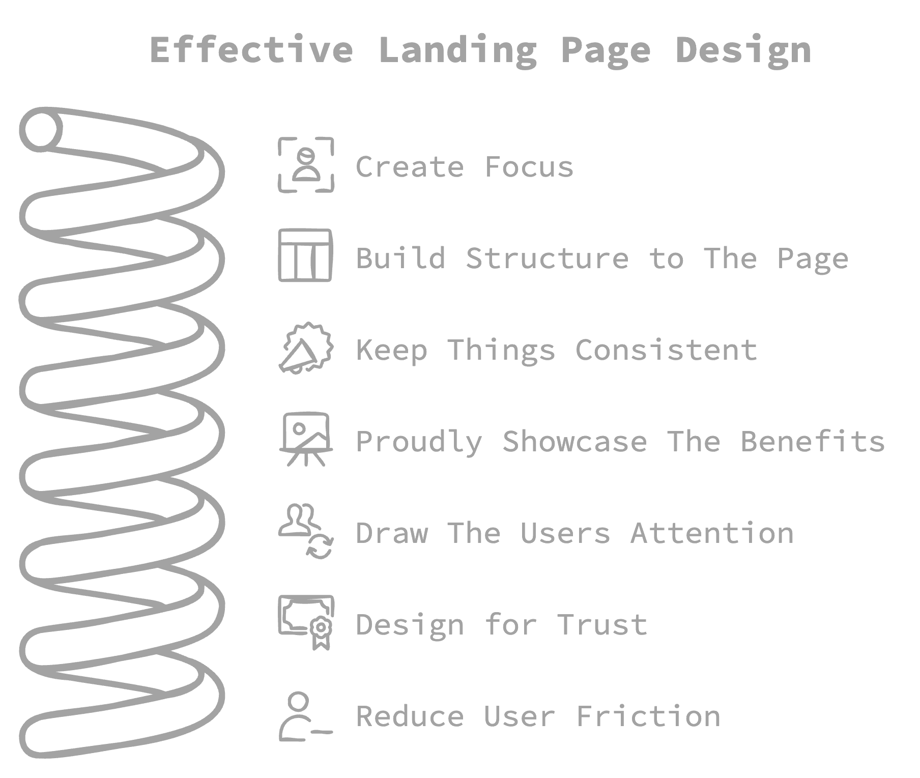
Create Focus
Every design element should be in service of one, singular campaign goal.
The more options or calls to action, the more likely visitors will be to get confused or distracted.
Focus eliminates the possibility of “paralysis by analysis.”
Build Structure to The Page
A conversion-centered landing page doesn’t just look good—it also subtly guides visitors to keep scrolling and take action.
The key here is to build structure and create a natural flow for your landing page.
Keep Things Consistent
Consider the entire ecosystem of your brand and your audience journey as you start to build out your page.
When you stay consistent between your landing page and your other assets—like your website and your ads—your visitors will be more likely to feel like they’ve “landed” in the right spot.
Proudly Showcase The Benefits
Have you ever heard the phrase you should “show not tell”?
When it comes to landing page design, the visuals are your opportunity to show audiences why they should care about your offer.
Draw The Users Attention
Use colors, fonts, patterns, and shapes to draw attention to particular points of interest on your landing page.
Use directional cues like eyelines or arrows to draw attention to your headline or CTA button.
Design for Trust
Make sure your testimonials are believable and trustworthy. We find that importing them from Google, Trip Advisor or any trusted platform is the best way to showcase reviews.
Highlight key details and use bold or highlighting effects to catch the attention of visitors.
Reduce User Friction
Simplify your forms by minimizing the number of fields.
Use multi-step forms to reduce friction and increase conversions. If a user sees 20 fields upfront, they may not fill out the form but splitting it into 4 pages of 5 fields encourages users to enter information in chunks, reducing friction overall.
A Quick Way to Improve Your Conversion Rate with Minimal Effort
Does optimising your own website sound like a lot of work? Why not get in touch with our team to lend you a helping hand! We do all the hard work while your get to focus on servicing all the new customers coming through your door.
Our team has extensive knowledge on technical website development, conversion rate optimisation and high performing web design. This post is a great start for any business looking to improve their conversions, but it only touches the tip of the CRO iceberg. Our knowledgeable team can guide and manage the entire CRO process for you, allowing you to make the most out of your current marketing spend. Get in touch with us today to see how we can help you!
Ugly and simple websites convert users better than visually stunning websites.
It’s a dark secret in the marketing and agency world and something most branding agencies won’t tell you when redesigning your website. Simple and “ugly” websites are easier to navigate, provide clearer calls to action and relay content more efficiently to users when compared to websites with fancy graphics, advanced animations & abstract layouts.
Understanding Conversion Rate Optimisation
Conversion Rate Optimisation (CRO) has the main goal of increasing your website’s overall conversion rate. Depending on your business, this is the number of users reaching out via a contact form, buying a product online, sending an email, downloading a guide, etc. When optimising for conversion rates, we are trying to get more users to become customers without requiring more spend on marketing or promotion.
CRO metrics can come in many shapes and sizes. The obvious ones are the number of form submissions a page got or the number of checkouts a store got on a certain day. But, we also care about other important metrics that often get overlooked by businesses.

Bounce rate – How quickly are users leaving a page once they click an ad or search result. High bounce rates often hint at a mismatch between content and user search intent.
Average site time – How long are users spending on the site before exiting across all pages. If a user spends a long time on the site but doesn’t convert, did we address all the questions they might have? Perhaps we didn’t effectively address their perceived buying risks.
Pages per session – How many pages are users getting to before leaving the site? Are they frantically trying to find a specific piece of information or are they visiting 1-2 pages before leaving.
Secondary Events – Are users doing things that aren’t considered a conversion but still show interest? Are they partially filling out the checkout fields or are they viewing the pricing page multiple times in a session?

Understanding What We Mean by an “Ugly” Site
Ugly is a broad term and could be different for each person. When we talk about an ugly site, we think of a site with simple graphics, lacking any fancy animations or abstract layouts which would be considered unconventional to the normal user. A great example of a popular but ugly site is Amazon.
Amazon has teams of designers, strategists and developers working to convert users at the highest rates possible. However, if you hop on their site, you’ll find the design overall uninspiring with no fancy graphics or “WOW” elements to engage with users. The site focuses on displaying the information users need, in the format they need it, in the place they expect to see it.

Ugly can also be considered conventional by some users. A conventional site has a generic header with a logo on the left and a menu on the right. It has a slider up top and some text and products below. Most of the elements stay within the centre of the screen and nothing moves too much unless the page is scrolled or interacted with. This is a stark contrast to most branding agency websites where the expertise of the agency is shown through their ability to create visually stunning yet abstract websites.
Why Ugly Websites Will Always Convert Higher Than Pretty Websites
Pretty websites decrease Conversion Rates because they abstract the value offer of the website as perceived by the user. When trying to optimise a website for conversions, we try to reduce the perceived buying risk of the user. We do this by addressing their concerns up front while also making the site easy to use in a format they can expect.

Have you ever tried using a new mouse or a new keyboard? You bought this shiny new keyboard which you know is better than your last one but for some reason you don’t feel great using it. The keys are slightly further apart, they don’t click as far, and the space bar is still stiff. This is kind of how users feel when a website is visually stunning but doesn’t fit into the same comfortable format they have come to expect from websites.

Ugly websites unintentionally present information and choices to the users in an optimal way by not abstracting them through fancy graphics or odd page placements. All the buttons are exactly where you think a button should be... If you wanted to get in touch you know that the contact page link is very likely in the top right of the menu. These are all subtle untrained expectations users have when browsing online thanks to the many years of websites using a standard layout.
Visually Stunning websites tend to also load more slowly for users because of all the additional overhead that comes with showing fancy graphics and animations. New users are incredibly impatient when it comes to websites loading. If you are sitting at home on Wi-Fi then awesome, even an unoptimized mess will load within a respectable time.

But... Pretend you are on a ferry travelling from Auckland to Waiheke. You are on your phone, the internet connection is inconsistent, the ferry is packed with loud kids and you have had a long day at work. Now all of a sudden a website that loads in 3 seconds at home may take 10-20 seconds to load on the ferry. You’ll lose that user before they even get to see a single page load.
Building High Converting Visually Stunning Sites with Conversion-Centered Design Principles
Conversion-Centered Design (CCD) is a framework for building high-converting websites and landing pages that are both visually stunning and also high converting. The following principles will help you create a high-converting website.

Create Focus
Every design element should be in service of one, singular campaign goal.
The more options or calls to action, the more likely visitors will be to get confused or distracted.
Focus eliminates the possibility of “paralysis by analysis.”
Build Structure to The Page
A conversion-centered landing page doesn’t just look good—it also subtly guides visitors to keep scrolling and take action.
The key here is to build structure and create a natural flow for your landing page.
Keep Things Consistent
Consider the entire ecosystem of your brand and your audience journey as you start to build out your page.
When you stay consistent between your landing page and your other assets—like your website and your ads—your visitors will be more likely to feel like they’ve “landed” in the right spot.
Proudly Showcase The Benefits
Have you ever heard the phrase you should “show not tell”?
When it comes to landing page design, the visuals are your opportunity to show audiences why they should care about your offer.
Draw The Users Attention
Use colors, fonts, patterns, and shapes to draw attention to particular points of interest on your landing page.
Use directional cues like eyelines or arrows to draw attention to your headline or CTA button.
Design for Trust
Make sure your testimonials are believable and trustworthy. We find that importing them from Google, Trip Advisor or any trusted platform is the best way to showcase reviews.
Highlight key details and use bold or highlighting effects to catch the attention of visitors.
Reduce User Friction
Simplify your forms by minimizing the number of fields.
Use multi-step forms to reduce friction and increase conversions. If a user sees 20 fields upfront, they may not fill out the form but splitting it into 4 pages of 5 fields encourages users to enter information in chunks, reducing friction overall.

A Quick Way to Improve Your Conversion Rate with Minimal Effort
Does optimising your own website sound like a lot of work? Why not get in touch with our team to lend you a helping hand! We do all the hard work while your get to focus on servicing all the new customers coming through your door.
Our team has extensive knowledge on technical website development, conversion rate optimisation and high performing web design. This post is a great start for any business looking to improve their conversions, but it only touches the tip of the CRO iceberg. Our knowledgeable team can guide and manage the entire CRO process for you, allowing you to make the most out of your current marketing spend. Get in touch with us today to see how we can help you!
HAVE A PROJECT
IN MIND ?